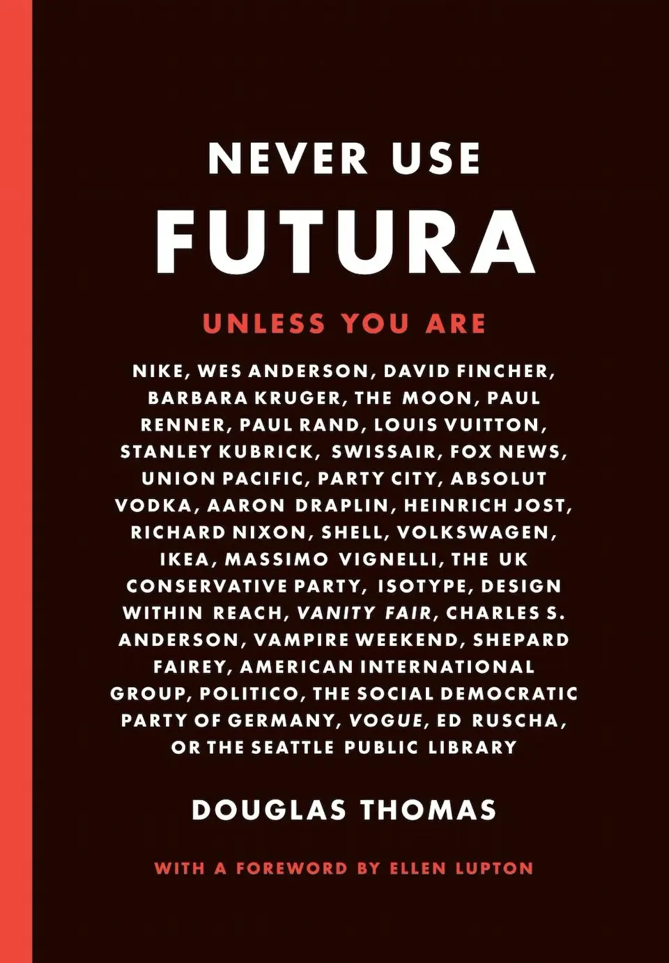
Never Use Futura
by Douglas Thomas
Added:
2023 Sep 04
Description
It’s everywhere, including the moon (on the commemorative plaque left by Apollo 11 astronauts), Nike sneakers, the artworks of Barbara Kruger, Ed Ruscha, and Jenny Holzer, 2001: A Space Odyssey credits, Domino’s Pizza boxes, Absolut Vodka bottles, and Red Bull cans. Richard Nixon used it for his presidential campaign, as did Hillary Clinton. Indeed, Futura is one of the most used fonts in the world today—the typeface of modern design—more so even than Helvetica. This fascinating book explores the cultural history and uses of a face that’s so common you might not notice, until you start looking, and then you can’t escape it. Douglas Thomas traces Futura from its Bauhaus-inspired origin in Paul Renner’s 1924 design, to its current role as the go-to choice for corporate work, logos, motion pictures, and advertisements. Never Use Futura is illuminating, sometimes playful, reading, not just for type nerds, but for anyone interested in how typefaces are used, take on meaning, and become a language of their own.
Notes & Highlights
3 DEGENERATE TYPOGRAPHY
When the United States entered World War II in 1941, government printers used Spartan, a Futura clone, on many of the country’s maps and as the official footer on its propaganda posters. Starting with the candidacy of war hero Dwight D. Eisenhower, every campaign for the next two decades (until Richard Nixon) featured Futura in some way, on buttons, posters, flyers, or other ephemera. But this doesn’t mean that there was some grand design: for the most part, American political designs were not that sophisticated. Everyone printed with the same typefaces as a matter of custom and habit. Democrats and Republicans advertised in both red and blue, using largely the same handful of typefaces: Franklin Gothic, Futura, and whatever else the local printer had on hand. This reflected not a political fascination with Futura, but rather the cultural dominance of Futura as an advertising and commercial typeface, which made it a clear choice for campaigns as well.
Get a copy
